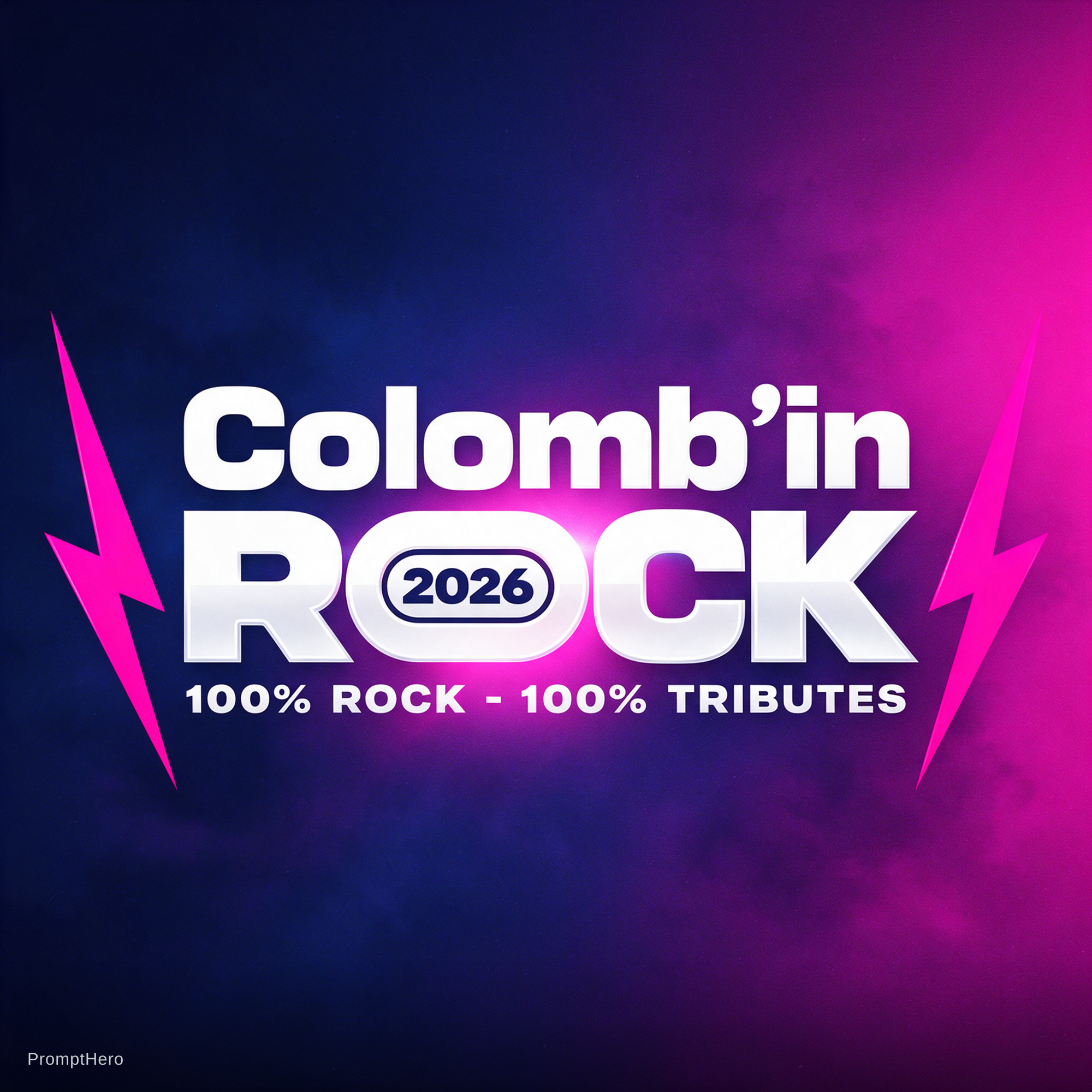
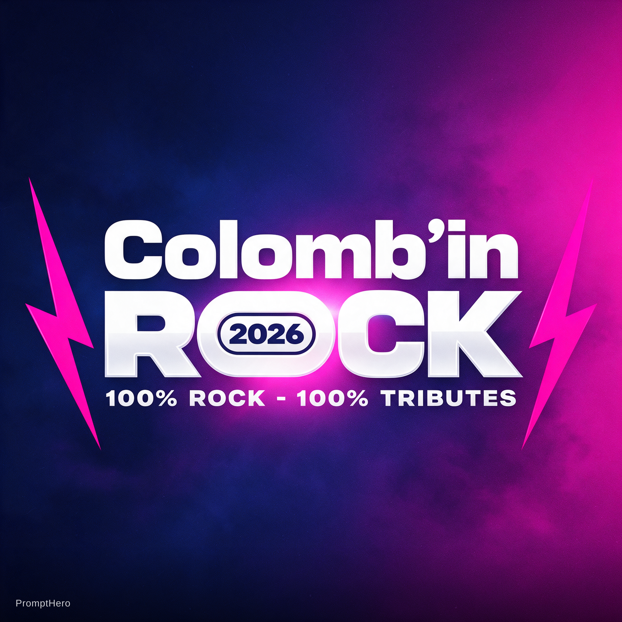
Redesign of a rock festival logo, wide horizontal banner, clean vector style.
Text exactly: "Colomb'in" on the top line, "ROCK" huge on the second line, "2026" inside the letter O, tagline "100% ROCK - 100% TRIBUTES" underneath.
Keep the original spirit: bold geometric sans-serif typography with rounded-square letterforms, retro-futuristic 80s/90s rock feel, pure white letters. "Colomb'in" in a wide extended font with a stylized apostrophe. "ROCK" much bigger and heavier, tight kerning, the O turned into a rounded pill shape containing "2026" in dark navy bold digits. Tagline in small white bold caps, evenly spaced.
Improve it: sharper and more consistent letter shapes, better balance between the two lines, a slightly more aggressive and punchy "K", a subtle metallic or neon edge on the white letters, and a light glow behind "ROCK".
Two jagged hot-pink lightning bolts frame the logo on the left and right, more dynamic and slightly angled.
Background: smooth gradient from deep navy/dark purple (left) to vivid magenta pink (bottom right), with subtle smoky texture and light film grain.
High contrast, professional festival branding, crisp edges, centered composition, no extra text, no misspelling, no people, no instruments.